If you drop by from time to time (I promise I don’t bite), you probably noticed the site looks a bit different. Just a little.
The first version was a light retouch of an Astro theme that many bloggers use, AstroPaper. What I hold against it is exactly what makes it good: it is simple, it works right away, and it has no identity at all. Dark navy background, orange accent, round avatar, a ~/56kode in the top left corner. You could land on three other blogs the same week and wonder if it was the same site.
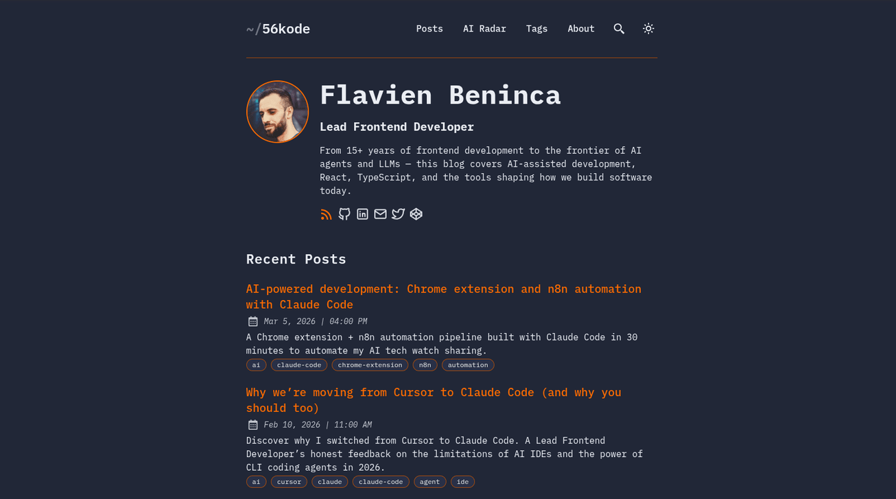
And then the content moved. You saw it, I went from a frontend/react dev blog to something that mostly talks about building with AI, with a curation section on top. The site was still telling the old story.
Anyway. Redesign. Here is how it went.
Finding an identity
The first thing I needed was the right identity. I could have done what I did before: browse free and paid templates, find one I like, adapt it.
I am not good at UI. I am a frontend developer, but making a visual is not my thing, it is not my specialty. So I thought about how to go at it and (boom) an idea came to me: I had wanted to try Claude Design for a while and never had the occasion, so why not now. People say it is great.
I open Claude Design. Right. Great. Now what, do I tell it “redo my site”?
Let’s be serious. I opened a regular Claude chat on the side, to prepare the ground. I explained what I wanted, which was a full redesign of my site with Claude Code, with an identity that matches my content, and I gave it the site URL. No problem doing that here: it was not going to draw anything, only analyze. And I was pretty happy with what came out. One point in particular: it understood the 56k/code pun on its own, and it told me what to ask for to get both the old side (the 56k) and the new side (code with AI).
It also gave me a piece of advice I would not have found alone, and it applies to any redesign: do not give your site to Claude Design, at least not at the start. It will lean on the existing UI and propose nothing original. You think you are exploring, you are only repainting.
After a few round trips I had a clean prompt for Claude Design. The plan was to test three directions on a single page, the home page, before going further. What I gave it: one article in markdown, one AI Radar entry, the full site map and a brief we had validated beforehand.
Out of the three directions, one appealed to me right away. It had plenty of flaws, but there was something there. I kept it and worked on it until I had something I really liked.
And then, a doubt. Do I like it because it is good, or because it is the only one I worked on? I asked for two more directions, to see. Neither convinced me. I stayed with the first one.
Picking the identity
Once the direction was chosen, I iterated until it matched what I wanted. Only then did I give the site URL to Claude Design, so it could fit a structure to the real content. In that order, not the other way around: identity blind first, structure informed second.
The direction I kept is dark only, with two tinted backgrounds (#070a09 with a phosphor accent #6ef7a5 for the site, #080c14 with a cold blue #9aabff for the AI Radar), no rounded corners, IBM Plex Mono for all the chrome and IBM Plex Sans for reading. The 56k pun lives in the details: CONNECTED · 56.6 KBPS · PING 340 MS in the status bar, NO CARRIER · ATH0 in the footer, a modem log on the 404 page, and signal bars used as an indicator all over the place.
Then we built the design system with its tokens, for reuse. After that we moved page by page, with prompts generated from my regular Claude chat, until the mockup was complete.
Along the way, a few contrasts needed fixing. The most visible one, or rather the least visible: the unlit signal bars blended right into the background, so a 4 out of 5 rating read as 4 out of 4.
Once the adjustments were done and the responsive layout was validated, it was time for the next step: the code.
From Claude Design to Claude Code
Several options exist. Claude Code can read Claude Design (it has skills for that), and you can also export from Claude Design. As I often do, I asked Claude about the possible approaches, and we went with an import triggered by a prompt straight from Claude Code, into a design-reference/ folder outside src/.
It imported everything on its own, no trouble at all.
And it helps to be clear about what that bundle is: it is not code you drop into src/. It knows nothing about my content collections, about Shiki, about the RSS feed, about view transitions. It is a visual reference. The real work behind it is a mapping job.
The rebuild
Now for the serious part. We ask Claude Code to write the migration plan from the mockup, to use the tokens properly, and above all to touch neither the markdown content nor the URLs, so the SEO does not break.
The order was fixed in the prompt, and it matters: tokens.css first, then the shared components, then the layouts, then the pages. With one simple rule, no hardcoded color, size or spacing anywhere, tokens only.
A few minutes later: honestly impressive. The site was ready.
We took the chance to remove some duplication. A single Card replaces two nearly identical card components. A SignalBars component replaces Unicode stars that were implemented twice, one version with escapes and one with literals, in two different files. And an ArticleBehaviors.astro replaces about 117 lines of script duplicated almost character for character between the two detail layouts.
And of course, not everything was perfect. The mockups brought their own inconsistencies, and there is no magic there: I went page by page.
The hamburger menu button stayed visible on desktop, despite its sm:hidden. Astro scoped <style> blocks are not inside an @layer, unlike Tailwind utilities, so a display: grid written in the component quietly overrides the class set in the markup. Nothing to do with specificity, everything to do with layers.
There was also a horizontal scroll on article pages, 197 pixels sticking out on mobile. The culprit was a pre > code { white-space: pre } inherited from the theme, which had been canceling Shiki’s wrap: true from the start without anyone noticing.
And a desktop mockup does not tell you what happens to its right column on mobile. On the AI Radar entries, the rating and the article details ended up stacked below the share buttons, with the summary pushed so far down that nobody would have read it. The order had to be rethought, not just left to stack up.
I kept going like that, on desktop and on mobile, until I was happy with it.
The audit, the audits
No way I was shipping without real audits. So I launched an orchestrator agent that dispatched specialized subagents. My starting idea was four areas: performance, design/UX, accessibility, SEO. We ended up with eight, adding mobile and responsive, content consistency, code quality and security.
Most of the work was writing the audit prompt. An audit that reports everything is useless: it has to report little, and report right. The constraints that made the difference are all bans.
Every finding had to carry a measurement, not an impression. Every finding had to state its consequence for a visitor, or it did not count. Ten findings maximum per agent, which forces the sorting to happen upstream. A list of banned recommendations per area, to cut short the generic advice everybody already knows.
And two purely technical bans: no using the chrome-devtools MCP (a single browser shared between eight parallel agents, they step on each other), and no running npm run build (eight concurrent builds corrupt dist/). Each agent had its own headless Chrome recipe.
Result: 22 findings. I grouped them into 14 subjects, because several landed on the same component, and I handled them one by one.
Here are five of them.
-
The Open Graph image was broken on every page of the site. Two bugs stacked on each other.
SITE.ogImageheld an empty string, and the code used??, which only catchesnullandundefined, so 245 pages were announcing the home page as their share image. The other 23 pointed at a 404, because the route generated/posts/<slug>/index.pngwhile the tag announced/posts/<slug>.png. The images existed, they were being generated fine, nobody could reach them. And all of it predated the redesign. -
The mobile menu turned into a black screen. The panel was positioned
absolute, anchored to the document, and the overlayfixed, anchored to the viewport. One swipe down and the two came apart: the panel left the screen while the overlay kept covering everything. A black page that responds to nothing. There were also 21 elements still reachable with the keyboard behind that overlay. -
The previous/next links were inverted across all 23 articles. “← Previous” pointed at a more recent article. The six articles in my “Level Up React” series ran backwards.
-
The fonts were going to Google on every page view, with the visitor’s IP. They now live in the repo. I checked by building the site with DNS resolution for Google sabotaged: 268 pages, 24 OG images, no error.
-
5.5 MB of images, including a 363 KB avatar displayed at 96 pixels, and a 1.77 MB screenshot inside an article about responsive images.
And then there are the ones I threw away. One audit reported a dead zone on the cards where clicks would not register: when I tested it, the link covered the whole card. Another saw a defect in two backgrounds being too close on the AI Radar pages, when that is the whole principle of the direction: surfaces there are separated by rules, not by their background.
And I also broke production. While working on the security area, we wanted to fix the Cloudflare TLS setting, which was on Flexible: the link between Cloudflare and GitHub Pages was running in the clear, and the redirect chain dropped back to http:// halfway through. Claude told me to switch to Full (strict), assuring me that GitHub Pages served a valid certificate for my domain. It had not checked. GitHub served CN=*.github.io, my domain was not on it. Error 526, site down.
The right setting was plain Full, without the strict. The chain went from three hops, one of them in the clear, to two hops, all encrypted. But the lesson is not about Cloudflare: a recommendation that touches production gets measured before it gets stated. An openssl s_client would have taken ten seconds.
The rest went fine. Images went from 4.98 MB down to 1.17 MB, and an article page now loads 62 KB on first render instead of 1,294. Lighthouse mobile in production gives 100 for accessibility, best practices, SEO and agentic browsing on the pages I tested.
In the end
All of this took me less than a day of actual work. Two hours at most for the visual research, one afternoon for the integration, then a few sessions of two or three hours for the audits and the fixes.
But the number is not the interesting part. What matters is that I ended up with something personal. AI tends to produce sites that all look alike, and that is exactly what I wanted to avoid. The method is what made the difference: the brief worked out before generating anything, my site that I did not hand over at the start, and several directions compared instead of a single one to take or leave.
And exploring costs nothing now. I asked for three directions, worked on one, then asked for two more to check I was not fooling myself. Doing that by hand takes days, so you never do it: you keep the first idea and convince yourself it is good.
What has not changed is that you still have to review. The mockup comes out in a few prompts, the site in a few minutes, and most of the time now goes into checking.